Tuesday, 30 November 2010

Ancillary Tasks: Advertisment research

I have analysied some music magazines that feature bands that have a similar brand image to ours, i am going to research into how brands market their new albums/singles in magazines that are seen by their target audience, magazines such as NME, Q and Rolling Stone. In order for artists/bands to sell albums, they need to market and advertise their products so that their target audience is encouraged to purchase them. By featuring in a magazine, typically for the bands genre, this gives them a good chance to sell their products to the right market of people. When a band are advertising their products there are lots of things that they need to think about, such as: Where to advertise, how to advertise, shots, lighting, mise en scene and text included etc.

Arctic Monekys (Album- Favourite worst nightmare)

This picture shows Arctic Monkeys on the front cover of the indie magazine NME, they are advertising their new album 'Favourite Worst Nightmare' hoping that people who like the 'indie' genre will buy it. Arctic Monkeys have been very clever and advertised their album  to come out just before christmas, this is a very good advertising technique as people will buy it as present. It shows the band dressed up as elves which catches your eye at first glance, something that the band want to achieve. The bands name is in big bold letters as peope who buy NME magazine will be very farmiliar with the band, so it will encourage them to read on. I think Arctic Monkeys have been very clever by advertising their new album in this way, it shows the lead singer at the front of the shot because fans will be most farmiliar with him. Even though the band are dressed up, their is still serious exressions on their faces which i think suits their brand image very well. 


This is another feature of the band Arctic Monkeys on their album 'Favourite Worst Nightmare', this is also advertised in the same magazine as before (NME) but inside the band have taken a different approach and done a page spread of the album inside the magazine. This page is an interview with the band discuissing what the album is about which i feel is a great advertisment technique, it will encourage fans to become farmiliar with the album and be attracted to buying it. The page also included quotes from various people who 'big up' the album, which is a good persuasive technique. I think that the layout of the page really suits the brand image of the band, the shot of them is very plan and of a serious manner which is what the bands brand image includes. It shows them in simple, stylish clothes which are also what the band are known for. The lighting of the shot is very affective, the background is plain and the lights are focused on the band which helps to catch your eye at first glance. The colour sceeme of the page, also matches the album that they are advertising which makes the page look neat and catches your eye as it is not overpowering.

By Emma

Ancillary questionnaire results


Once I gathered the results from our questionnaire, I put them in graphs and analysed the results. It is important for us to understand why we have got these results and put them in our brand image and ancillary tasks which will appeal to our audiences and our secondary audiences.

By Romany

Ancillary Tasks: Questionnaire

Before we plan our album, 4 panals and our magazine advertisements, I have put together a questionnaire which we are going to hand out to 10 people in our target audience age range to find out what attracts them to albums and magazines. This is important researsh as it gives us excellent feedback to which we can reply to our projects to make them appropiate to our target audience and our secondary target audience.

To make this questionnaire, I used Miscrosoft word to put the questionnaire together and I then used scridb to change the format of the questionnaire to be able to upload it to blogger.
 

I have created this questionnaire to get as much information as possible from our target audience to understand what is needed from our ancillary tasks to appeal and sell on the market.

By Romany

Monday, 29 November 2010

Progress - Week Two of practical

This week, we started to edit our music video and we also did some filming using the green screen with one of our characters, Tom. When we were filming using the video camera, we also took some still pictures using a camera to show what we were doing. This week, we used a video camera, tripod, green screen, the professional lights, iMac computer and final cut express which we are editing our music video on. 


This is the green screen with the back lights focusing on the vinyl which we put in the middle of the green screen to get the best lighting we possible could. We had to put an extention lead on the green screen in order for the vinyl to work but we made sure it wan't in shot. 


This is Richard putting the name of our song on the vinyl, we wanted to test this and see if it would work in black and white. When we edited, we came to the conclusion that it didn't work which means we have to film this bit of the video again. 


This is me recording the vinyl spinning around and trying to get the best shot possible and use the lights effectively. The video was recording a close up on the name of the band on the vinyl.


This is a picture of Richard filming Tom running on the spot on the green screen. We have done this to show our techniques in using the green screen and the lighting. Also, we have filmed this as we are showing our characters running against the power of the vinyl to represent their state of mind as they are on drugs. 


However, once we started to edit the filming we did in the green screen, we noticed that the lighting wasn't correct which brought us to the agreement of filming the scenes again and taking more time lighting the room correctly. 


This is the first part of our editing, we have used colour correction to make our footage black and white and to distort our image a little. 


This is Richard editing some of the filming we did the night before, we are using the guides as well to make sure we used the correct techniques.
This is me editing the colour, I have increased the blackness to make it more distorted and I was checking the guide to make sure that I had used the right techniques.
Here is Emma finishing up the first part of editing the colour of the start of the video, as we had some lines around our image, Emma was changing the numbers to try and refine the lines around the side of the films. 


By Romany


Sunday, 28 November 2010

Editing and Filming Schedule

Over the next 4 weeks, we have to finish filming and editing our music video and produce our ancillary tasks which include, digipacks and magazine advertisements. These also include research and planning. 


This week, we are editing our music video in lesson and after college between 4pm and 4:45pm, we are staying behind after college as we need to spend lots of time editing our video to make it applying to our target audience and make it successful to fit into our brand image. On tuesday, we are staying behind at college again from 4pm till 4:45pm to film some more of our music video in the studio where we will be using the green screen and lights again. 


In the next following weeks, we will be editing our music video and our ancillary tasks before our deadline at christmas. 


By Romany, Emma and Richard

Ancillary Task Digi Pack research

Album covers are often defined by the genre of music the album contains. They sometimes can be relevant to the genre or random. The factors that make some album covers different to others are colours, fonts and images. Album covers can be used to draw in public attention however also can create varying ideologies depending on the person looking at it.


This Gnarls Barkley's cover for his debut single called crazy from his first album St. Elsewhere. I like this album cover because of the connotations that it creates. The colours work fantastically well against the white background because of the extreme contrast. This could possibly be used in order to catch peoples eye when sitting on a shelf. I also like the animated image on the front. It looks quirky and different to what would usually be expected from any other hip-hop artists.

Referring to the point I made before, the album cover can be influenced by the genre. This is the cover for Fyfe Dangerfield's album called Fly Yellow Moon.


I particularly like this album cover because of the image. Fyfe Dangerfield is an english indie artist. As can be expected from indie music, the cover is very random with the man dressed in a suit emerging from a field of yellow flowers. However, the colours in the image do relate to the title of the album, 'fly yellow moon'. Although I cannot find any images of it on the internet, having bought this album, I discovered that the yellow flowers theme runs all the way through rest of the casing. The theme also on the disk it self. This gives an idea of recurrence and creates a consistent theme.


This is Iron Maidens cover for their biggest single Number Of The beast. I like this album cover because it continues the typical Iron Maiden theme of animated demonic, scary characters. The colours are naturally dark colours but however seem to stand out on this cover. Iron Maiden have used the characters they use on their album covers as a marketing strategy. Each character has been named and now are sold as memorabilia. Iron Maiden also have used the same font throughout all of their albums. This makes it immediately clear to anyone exactly who the record is by. It is this recurring theme that make Iron Maiden covers so recognisable.

By Richard

Ancillary Tasks: Digipack research

To go along with our music video, we are also producing digipacks and magazine advertisement's to fit with our brand image and target audience. We have researched many album covers and magazines to gather ideas and create our own.


The Rolling Stones - Exile on Main Street.


This is the tenth british album and twelfth american album by The Rolling Stones. This album cover applied to me as it is the brand image of Rolling Stones. The main part that applies to me is the black and white images and the one colour image which is their logo and it very well known around the world, especially from their album - Forty Licks. The images on this album betray the typical connotations of the rock and roll life style of drugs, partying and sex. The images are also a bit distorted which can symbolise the state of minds of the band. This album cover appeals to the rebellious, drug using teenagers who are out to have fun and this is what The Rolling Stones and our brand image is about. This album cover applies to the working class and our brand image and target audience applies to the working class, which is why we are using The Rolling Stones to gather ideas about our own brand image, digipacks and magazine advertisements. The props that are involved in this album cover are very typical of the rock and roll life style which applies to so many teenagers. This type of art work on the album cover is something we are very interesting in doing ourselves and maybe using this type of editing to create the same feel with our album cover that The Rolling Stones created. 


Led Zeppelin


This is a very simple album cover by Led Zeppelin but it is very effective. The random images over the colour represents the different brand image that Led Zeppelin has but they are mostly known for their rock and roll life styles. The simple colours on a white background make this album cover stand out and be recognised, it also fits the target audience of Led Zeppelin. This theme runs throughout the album and applies to the whole target audience. It is also very different to the type of music Led Zeppelin  produce and promote, the art work if very calm compared to the music but it represents the connotations of rock and roll very well as the images are random and they show drugs, sex and rock and roll. 


This is inside of the album and the disc. I like the randomness and the use of bright colours on the CD as it stands out from other rock and roll band and is noticed by their target audience which they have promoted very well too. The way the images are just put together on the CD is very well done and it applies to many audiences and has given me ideas for our album cover. 


To make sure we create the right 4 panels for our ancillary tasks, we are going off templates which professionals use in order to create a CD relevant to their artists.


This is a template of a CD case, these are used in order for the CD to be created properly and to make sure it appeals to the primary and secondary target audience. 


Sex Pistols

When this album by the Sex Pistols was released it was highly influential and controversial as they were a punk british rock band. This is a very well known album cover and has influenced many albums since then. The bright colours of yellow, pink and black all stand out against each other and this is the brand image for the Sex Pistols as these colours run throughout there many albums. I have chosen this album to look at as it is very successful in appealing to its target audience and they know there brand image very well. I really like the logo of the Sex Pistols and how they have used the bright colours effectly. This shows connotations of there genre which is mix matched. The fonts on this album cover continue throughout there other albums as it is their housestyle and it makes the audiences aware of them as they automatically associate this font and housestyle with the Sex Pistols.

By Romany

Thursday, 25 November 2010

research - digipacks examples

Aswell as producing a music video, we also have to produce auxilary tasks, which are to produce four album pannels and 2 magazine advertisments. First, we are going to analyse album covers that are related to our brand image for the music video we are producing. Our brand image is english rock and roll, rebelious adolesence, working class etc and the genre our music video will be is 'indie rock and roll'.  Below are some of the best examples of covers that would work really well to create our brand image:

This is The Rolling Stones album cover for their album 'Beggars Banquet'. I think this album cover pefrectly sums up the brand image that we are trying to protray. It is gritty, dirty and scruffy, exactly the kind of toilet you would find in a rock and roll night club. It gives off conotations such as drug use which is what our music video 'bad candy' is featured around. The yellow tint of the shot gives it a old effect and the writting on the walls adds in the music side of this album as bands have singed there name on the far wall. The cover hits the rebelious, adolesence music scene as you would probably find a teenager taking drugs or being sick (rock and roll liftstyle). We will be using ideas and things this album cover wants to protray in our own music album cover as we think that it gives off the rock as roll/drug abuse/realsim that our music video will also show. Our brand image also includes the working class, this album cover defitnatley gives off conotations of working class, as the toilet is run down and very basic. This is a conotation that has been shown well in this cover and we will take ideas from this. Props in this shot also work very well, there is an empty bottle which looks like a bottle of licque. This gives off the impression of being rebelious which is part of the brand image we want to create.


This is a cover called 'Shotters Nation' for the English Indie band Babyshambles. I particularly like the creativity of this cover which gives off the conotations of artistic and independant which is definartley a part of our brand image. The image is rough and careless which shows the rock and roll side of this cover. The images work particularly well to create the brand image similar to ours as it gives off conotations of sex with the women in her underwear and drugs as a man is lying on the floor, these images really show the brand image of rebelious, rock and roll. I also like the black and white effect that the cover has, as it gives off the working class, nitty gritty effect which is something we are interested in using. The writing of the band is rough and in your face, which is also what the music in 'Bad Candy' is.


By Emma

Sunday, 21 November 2010

Progress - Week One of practical

During this week, we have finialised our ideas and put together a filming schedule so our whole group knows what they are doing and when it has to be done for!
This week, We have filmed our story board and put it together using Final Cut. This was very useful as we gained more experience in using this programme and we now have the basic skill to put together a music video and we will continue widing our skills through out this project.
Also this week we completed a risk assessment to make sure we knew the risks about using the studio and the lights and wires that will be about.
At the end of this week, we filmed Fallon and Thom getting ready for the night out and then we filmed Fallon on the night out but only at certain points. In the next week, we will be editing what we have already shot and will be getting the last of our fotage to make sure that we have enough time to edit and make our music video appeal to our target audience.

By Romany

Friday, 19 November 2010

Completed Rick Assessment Form

This is a  completed rick assessment form. We completed this form so we can film our music video safely and with knowledge that everyone knows the health and safety rules. It is important to fill a risk assessment form as there will be some risks that everyone needs to be aware off when we are filming. The greatest risk for us is when we are in the studio and the wires for the lights and the tripod get in the way as this can cause someone to slip and injure themselves which we don't want to happen. 

By Romany, Emma and Richard

Risk Assessment Form


Filling out risk assessment forms are important in any line of practical work but it is really important when we are filming our music video that we fill a form out to generalise the risks that will be around in the many locations we use. There is a medium risk for everyone that is involved in our music video as we are filming in the dark, in crowded places and there will be the tripod stand which can get in the way of people and our actors
By Romany

Story Board Animation


This is our story board, edited in final cut. We have learnt how to split the screens which will be a massive part of our music video. We did this on our animation to make sure we are as close as we can be to our video and to gain the skills we needed to use this part of final cut. Every sceen is going to be in split screens to show the different stories of the night out but in some parts of the music video, we are not using split screens. We have done this to show our wide range of skills and also to make our video interesting and to comform multiply viewings by our target audience.
By Romany, Richard and Emma

Tuesday, 16 November 2010

Lighting Training

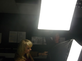
We spend some time in the editing suite as a group and learnt about how to create the best lighting to ensure we have no shadows around our artist. 


These are the lights we used for our training. As you can see, they are spaced apart and pointing at the white background, for our training we have decided to move them so they only focus on the artist. 


This is Emma and Richard arranging the lights to shine down on the artist. Before they did this, we had training about how to move the lights safely and how to change the brightness of them. 


Here, Emma and Richard are moving the lights so they are in a straight line so the light fixes on the top half of the artist. This was very important in our training as we don't want shadows around our artist and by learning to use the lights effectively, that won't happen. 


Once we got the lights at the right height and in the right place, we used a light enhancer to make the light jump off and make my face light up and not be soft against the white background. 


This is how the arranging of the lights and the light enhancer made me look. I have shadows around me, this is a problem as we didn't want shadows. As this is our first time using these lights, we won't make this mistake again and will move the lights around to get the image we want. Also, we will probably ask our technician to show us how to put the lights in the right place in order for us not to get a shadow unless we intend to. 


This is Emma using a still camera and being taught how to use it when in the editing suite. Emma was seeing how the lights were effecting the image and how we can change the settings on the camera, as well as the lights. 


This is Richard, he is learning how to use the video camera and get the settings right so we can film our video correctly. It is important that we all know how to use the video camera so we can all shoot some of our music video.


This is Romany, she is using the still camera and taking a picture of Richard and Emma learning how to use the lights effectively.


By Romany, Emma and Richard

Institution: Independent Record Label

To meet the demands of any target audience, every band is signed to a record label. This is to make sure they have enough money for the marketing campaigns, the video, the CD and the tour. Every record label and media text is recongised by the band or TV programme they market. For example, BBC 3 is popular with teenagers as it shows comedy programmes such as Family Guy which is very popular with young adults. Channel 4 is known for its rebellious characters in the media texts which are shown on the programmes, for example, Hollyoaks has many rebellious characters featured in it.
When considering music, the main record labels are known as the 'BIG 4', these are Universal Music Group, Sony BMG Music Entertainment, EMI Group and Warner Music Group. Each of these record label owns some of the biggest music starts around at the moment and they are partly responsible for the success for these artists.

Universal Music Group

This record label sells more music than any other record label. They have some of the top sell artists signed to their label. For example, Lady Gaga, Black Eyed Peas, Cheryl Cole, Ne-Yo and Rihanna are all signed to the mini labels that make up Universal Music Group.


Sony BMG Music Entertainment

Sony and BMG used to be seperate record labels until August 2004. They merged together and each label owns 50 per cent of the label each. Sony BMG owns many of the biggest artists around at the moment and they also have signed some of the biggest names in music ever, for example Michael Jackson. Here are some of the artists which are signed to Sony BMG: Alicia Keys, Beyonce, Usher and JLS.

EMI Group

EMI is the third biggest record label in the world. It owns artists such as, Robbie Williams, Coldplay and Queen. Even though EMI hasn't signed some of todays most popular artists, it is still seen as one of the biggest record labels in the world by signing of the most popular and influential groups in music, Queen.


Warner Music Group

Warner is the fourth biggest record label, it has remained successful by signing key artists, such as, Madonna, Oasis, Paramore and Plan B.


These record labels dominate the music industry and they make it hard for independent record labels to promote their artists. Indie labels find it hard to market their artists and give them high tech CGI and Green Screens for the music videos as they have a limited budget and can't make the videos that Lady Gaga makes becuase they don't have the money. However, they have other ways of promoting their artists and still produce a video with audiences would like to see multiple times. Our band will be signed to the indie record label, Rough Trade Records.
We have chosen this record label as it works with many indie rock bands and helps push their brand image across. One of their artists is The Libertines. We have looked at their videos and brand image and they have given us ideas for our music video. Rough Trade records broke into the US in 2007 when they joined with The Beggars Group. This has pointed Rough Trade in the right direction as British Sea Power taking ''Do you like Rock music?' into the Top 10 and onto the Mercury Prize shortlist in 2008, their artists such as, The Hold Steady find themselves rising stars.

By Romany

Sunday, 14 November 2010

Storyboard


This is our story board. We put a lot of thought into our music video and made sure it appealed to our target audience. We have had many ideas and this was our final idea which we decided to produce. We are using many close up's and medium shots. We have also decided to use high angled and low angled shots, we have used these to show our protagonists as superior and inferior at certain points of the music video. The high angled shots will mainly be used when the protagonists are taking cocaine so show they are feeling superior to anyone else. The music will kick in after the 4th shot and once the music starts, there will be excessive use of split screens and cut shots to show the minds and the feelings of Fallon and Thom. We will be using slow motion, point of view shots, blurred images, birds eye view shots and motion shots (camera jumping). There will also be use of diagetic and non-diagetic sound.

Shot One: Introductory shot, vinyl going clockwise from above. A birds eye view shot, medium/long shot. At this point no music will be played. This shot will be black and white

Shot Two: Close up on the name of the song. Still a birds eye view shot, at this point, our character will be placed on the vinyl and fighting against the speed of the vinyl to represent their state of mind. Black and white shot and no music.

Shot Three: Medium shot of our characters going around trying to fighting the speed. Still no music being played and black and white

Shot Four: Close up/Extreme close up of our characters on teh vinyl. We may be changing this shot and getting a low angled, side view, extreme close up of the vinyl going around with the niddle on the disc. Black and white shot and no music being played.

Shot Five: The music starts at this point, cut shots will be very quick, 2/3 seconds each of the giutar playing. An extreme close up of fingers and strings. This shot will be when the colour starts to kick in as well but it will be a bit distorted.

Shot Six: Close up shot of Fallon, our protagonist female, getting ready for the night. The camera will be positioned by the side of her. This shot will have colour but will be slighty distorted.

Shot Seven: Another cut shot lasting upto 2/3 seconds. Medium shots of people outside the club/pub, drinking and smoking. This sets the scene for where our video will take place and the audience starts to know what might happen in the video.

Shot Eight: Medium shot of our male protagonist, Tom, getting ready for his night out. This shot will also be a cut shot, every quick shot, around 3/4 seconds.

Shot Nine: Back to the extreme close up of the guitar playing and the strings. This will be a quick shot as well as the editing has to keep up with the pace of the video which will resort in fast paced editing.

Shot Ten: Extreme close up of our female character putting red lipstick on. We will edit this to speed it up and also cut out some frames to make it jumpy so it pushes the conventions of a typical music video.

Shot eleven: A long shot of the club, high angled. Fast paced shot to meet the fast paced editing.

Shot Twelth: A medium shot, lowish angle of Tom sitting at the table, picking up a £20 note and taking some cocaine. There will also be close up's of the cocaine and Tom's fingers around the money.

Shot Thirteen: Last shot of the guitar, extreme close up of the fingers and strings.

Shot Fourteen: Close up of cocaine on the table in our female protagonists room with just her arm and hand coming in and out of shot. Close up of her taking the cocaine.

Shot Fifteen: Our video know goes into split screens. This is to show the minds and night out off our two protagonists. Low angled shots as they walk into the shot and away from it to the club, this is so we can hear the shoes on the ground. THe lighting will be low key lighting as it is at night.

Shot Sixteen: Split screen continues. Point of view shot of Tom drinking and a low angled, close up shot of Fallon smoking.

Shot Seventeen: Point of view shot from Fallon walking into the toilet and talking to her friend. At the same time, we have a birds eye view shot of Tom sat down against the toilet with a roll up next to him.

Shot Eighteen: High angled shots of them both standing at the side looking spaced out with people moving around them. This will be edited in final cut where we will speed the people around them up and make them hazy.

Shot Nineteen: Fallon is dancing but still looking spaced out while the dancers around her are going to be edited in final cut to speed them up, this will be a medium shot. Tom is stood by the side looking onto the dance floor also looking spaced out. This will be a medium shot, low angle.

Shot Twenty: Fallon to outside smoking, point of view shot. All you see is the cigerette and some of her friends in as it is coming from Fallon. In the other split screem, there is a low angled close up shot of Tom taking some more cocaine in the toilets.

Shot Twenty One: Point of view shot from Fallon walking to the toilet, dumping into people by accident. Tom is leaving the toilets at the same time, this is also a point of view shot. Tom is shaking which makes his image distorted, showing the effects of the cocaine.

Shot Twenty Two: This is when Tom and Fallon dump into each other and it becomes a two-person frame. Both are point of view shots until they dump into each other and the split screen becomes one screen again.

Shot Twenty Three: The screen splits again and they go into opposite screens. There is a point of view shot used by Tom showing him smoking and a low angled, close up of Fallon taking some cocaine in the toilets.

Shot Twenty Four: Extreme close up of Fallon's and Tom's eyes slowly closing. The screens change from being completely black to opening again.

Shot Twenty Five: The screens are both black now to show the audience that they have both blacked out. Extreme close ups and low key lighting is used.

By Richard Romany and Emma

Ideologies

In any music videos, there are ideologies that are put across to the audience in the lyrics and narrative of the video to appeal to the target audience. The messages and values of music videos change according to the artist of the video, the target audience and the narrative of the video. The most popular ideologies that is dominant in most music videos are the ideas and beliefs that are in society today. For example, in romantic music videos, the domnant ideology is 'Love conquers all' as this is always a part of society any where in the world.

The dominant ideologies in our music video are dominant in the teenagers society of today. It is all about having fun, living like there's no tomorrow, finding love and breaking the rules. This appeals to our target audience off our sub-genre as this is very rock and roll and espicially indie rock and roll. These ideolgies have been around since the early days of rock and roll and they became very popular thanks to bands such as, The Rolling Stones and Oasis.

By Romany

Feedback: 14/11/10

Excellent research and planning group! Nearly all areas covered - just a few suggestions below..


- Synopsis/Narrative - dont forget to get your narrative theories in here - as you are doing a narrative video
- Keep pushing your theory -
-Target Audience Section:  Include Maslow (audience theory) how does your product appeal to the audience - fulfil basic human  needs?
-  what ideologies are you pushing? ( e.g. brand identity is included in this? why does this appeal to your target audience?
- Costume photographs - for your planning?
- risk assessment form for your shoots - a template can be found on Moodle.
- Institution: who would be promoting and paying for the video? A British Indie label? (Rough Trade etc...)
- practice shots - e.g. you record/chroma- key shoot etc...
- scanned storyboards and animatic
- a scanned filled out audience questionnaire sheet.


Well done! Miss McNulty

Friday, 12 November 2010

Filming Schedule

In order to make sure we are all free and available when we are filming our music video, each of our group knows when each other is free. One of our main characters does not study at St Mary's so we have contacted her and she stated that she is free whenever we need her. 


Here are the periods in which we are all free within to film and edit our music video. Also, we are all free after college every night. 


Monday - all free after college
Romany - 1, 2 and 5
Emma - After 1
Richard - After 12:15


Tuesday - all free after college
Romany - 1, 2, 3, 4, 6, 7, 8 and 9 
Emma - after half two
Richard - 1,2


Wednesday - all free after college
Romany - 3 and 5
Emma - 1-5 7-9
Richard - 1,2,3,8,9


Thursday - all free after college
Romany - 1,2, 6, 7, 8 and 9 
Emma - free until one
Richard - 3,4,5


Friday - none of us are free on a friday evening
Romany - 3, 4, 5, 8 and 9
Emma - free 3-5 6-9
Richard - 5,8,9


By Romany, Emma and Richard

Thursday, 11 November 2010

Location Shots

Here are some images of the places we are using for our video, they fit very well with our brand image and they will work very well within the video. 


The Live Lounge, Blackburn.


We are using 'The Live Lounge' as our main location for our music video. We have decided this because it fits very well with our type of sub-genre and it is a very popular night club with the older range of our primary target audience, 18-25 years old. 
Coperation Park - We are using this to show the outside of the characters houses. 


The Studio 


This is the green screen. This is very useful and successful when used in a music video if lighted correctly. We have decided to use the green screen to show our wide range of media skills and is make our video look as professional as possible. 


This is the white background which we did our light training on. This can be used for casting shots and photo shoots as it shows a clear background and draws all the attention to the artist or band when they are having a photo shoot for either their new album and single or for a magazine. 


The Toilets


As we are showing drugs being used in our video, we have decided to use the toilets from college for this as even though we are not using real drugs, we do not have permission to use sherbet or sugar in The Live Lounge, this is very understandable so we have asked permission from our teacher if we can film this section of our video in the college toilets instead and we have been given permission. 


By Romany, Emma and Richard