Question 1: In what ways does your media product use, develop or challenge forms and conventions of read media texts?Within the answer to question one, we answered, as a group, 'In what ways does your media product use, develop or challenge the conventions of real media texts?'
Conventions of real media products: CD Album (ancillary one):For our 4 panels we made sure that our brand image was visible throughout the album and made sure that it appealed to our target audience just like our music video. For the album, we analysed many real media examples that were in the rock and roll genre. We looked at albums from bands such as 'The Rolling Stones', 'Bob Dylan' and 'Oasis'. These bands sum up our brand image and they combine the rock and roll genre with the indie genre just like we did with our product. When we were researching and planning our panels. We looked at The Rolling Stones as they influenced our product a lot.
 This front cover of the 'Beggers Banguet' album was very much like our brand image of having fun and not caring about the consequences. Also, the colour use is very successful and links very well to the rest of the album. The red against the yellow background makes it stand out and catches the audiences eye. This album cover, also, shows the brand image of 'The Rolling Stones' as they are all about having fun, enjoying life, drugs, sex and drinking. This links very well to our brand image and to the audience 'The Rolling Stones' aspire to appeal to and they do this successfully.
 This collage of Bob Dylan appealed to us and gave us our idea for our front cover. This would appeal to Bob Dylan's audience as it clearly shows the brand image and the type of audience he appeals to. Also, the black and white images are easy on the eye but different to other media products and this makes it stand out against the rest. Bob Dylan knew the ages and types of people he wanted to appeal to and I think he successful did this and his brand image appeals to the wider audience as well. This is a sign of a good marketing and brand image as they didn't exclude half of the population with the type of target audiences. Within our CD Album, we planned this carefully as we wanted our brand image to be visible throughout and there to be a link between our video and panels to make our audience connect the two together. The main part of our CD album was the front cover as this had to grab the readers attention.

In our front cover, we used typical conventions of the rock and roll genre as this is the genre of our products. The images were very important as they needed to appeal to our audience. I think they challenged typical conventions as the use of cigarettes is normally more subtle but we have them on show and used throughout. The colours were very important as we made sure the house style was the same throughout as this would make the product familiar with our audience. The black background was the last thing we decided to do as we weren't sure whether to have a white background. However, I feel that the black background fits very well with the style of our whole product. The use of the colour pink was very important and necessary as this was one of the main conventions in our products as colour is very important as it appeals to the audience and attracts their eye. This pink was carried through the whole of the album:


Question 2: How effective is the combination of your main products and ancillary texts?


Conventions of real media products: CD Album (ancillary one):For our 4 panels we made sure that our brand image was visible throughout the album and made sure that it appealed to our target audience just like our music video. For the album, we analysed many real media examples that were in the rock and roll genre. We looked at albums from bands such as 'The Rolling Stones', 'Bob Dylan' and 'Oasis'. These bands sum up our brand image and they combine the rock and roll genre with the indie genre just like we did with our product. When we were researching and planning our panels. We looked at The Rolling Stones as they influenced our product a lot.

In our front cover, we used typical conventions of the rock and roll genre as this is the genre of our products. The images were very important as they needed to appeal to our audience. I think they challenged typical conventions as the use of cigarettes is normally more subtle but we have them on show and used throughout. The colours were very important as we made sure the house style was the same throughout as this would make the product familiar with our audience. The black background was the last thing we decided to do as we weren't sure whether to have a white background. However, I feel that the black background fits very well with the style of our whole product. The use of the colour pink was very important and necessary as this was one of the main conventions in our products as colour is very important as it appeals to the audience and attracts their eye. This pink was carried through the whole of the album:


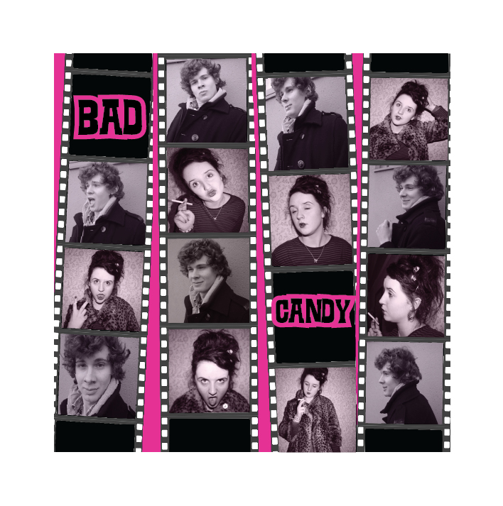
These panels go inside the album. They continue the brand image throughout and appeal to our target audience. For these images we used the typical cinematography conventions of the rock and roll indie genre. There are many uses of close ups in the video and in the ancillary tasks as they make the audience feel involved, which is what we were going for.

This is the back panel. Out of all the panels, our target audience said this appealed to them the most as it clearly defines our brand image of breaking the rules, having fun, drugs, cigarettes etc as the 'no smoking' sign shows that we are breaking the rules. Also, our audience liked how the song names stood out against the black and white background as they stated how the colour helped them link our products together.
Conventions of real media products: Magazine Advert (ancillary two):When we were planning our magazine adverts, we looked at adverts from Oasis as they have influenced our media products.
Question 2: How effective is the combination of your main products and ancillary texts?

This magazine advert was very successful and it gave me the idea for the portrait advert as I liked the cinematography and the facial expressions that attracted my eye and did the same to our target audience. The simple colours of blue and black are simple but effective as they stand out and fit the brand image and style of Oasis.
For our magazine adverts, we decided to do a typical magazine advert but then break the typical conventions with our second one. 
This is the magazine advert that followed the typical conventions of our chosen genre. The image clearly shows how she fits the 'stereotype' of audiences that watch and listen to the rock and roll indie genre. As you can see, we made this advert with a tint of pink to connect our products together. I think this worked really well as it is different to our other products and appeals to the audience. The way the writing has 'blended' into the background to a very useful and successful effect.

This magazine advert challenged the typical conventions of a magazine advert as it is landscape and audiences don't see many landscape adverts. I think this was very successful as when we got audience feedback, they stated that it appealed to them as it was different to a typical advert. The image clearly shows our brand image and how they are all linked together with the drug use convention of the rock and roll and indie genre that we connected together.
Question 3: What have you learnt from your audience feedback?
Question 4: How did you use Media technologies in the construction, research, planning and evaluation stages?
Throughout the stages of our media project, I used many media technologies that were used in many of the different stages that we had to go through to get our final project of our music video and ancillary tasks. In each of the stages we used technologies such as, Google, YouTube, PowerPoint, Microsoft word, iMac, video camera, final cut, photo shop and InDesign. All of these technologies were very important in our project and they helped us create the best project possible.
When we first started our project and were researching many different music videos, bands and CD albums and magazine adverts when we created our ancillary’s. We used google and google images often.

We researched many different bands through Google and this is a very successful media technique to use as it has the up-to-date information on bands and their information which was very useful for our research project.

This is the PowerPoint that I did for question two of my evaluation. PowerPoint is really easy to use and it is perfect for analysing or creating an answer that has to be annotated as the arrows are very easy to place into the PowerPoint. Also, it is very easy to change the background design and the font, colour, size and position of the writing. This is what makes PowerPoint so easy to work with as it isn’t over complicated and I use it many times without a problem.
Once we had found the information that we needed, to complete the research, we needed images to help explain what we had written. We used Google images as we could find, very easily, the images we needed and it is a very easy media technique to use.

As we continued our research into the bands that influenced our music video, we used YouTube many times to find the videos that we knew were part of our genre and would help us when we planned our music video and ancillary’s.
I used YouTube many times throughout the project, not just at the research and planning stage as it was needed at the evaluation stage for question one when we were finding the videos that we had to talk about as they had influenced our media project. When we were searching the music videos that influenced us, it was sometimes hard to find the right one so we had to expand what we put in the search window. YouTube is very easy to use and find your way around. I use it often and there are never any problems with it.

As there was lots of research that had to be done at the beginning of our project, we had to put our questionnaires onto our blog to show that we had done target research. To do this, we used Scribd to convert the Microsoft word documents so they would be able to be put on our blog. Once they had converted, I copied and pasted the embedded code onto the blog post. This was very simple to use and it didn’t take too long for the Microsoft word documents to be converted.

Throughout the project and especially when we were researching, we wrote down many notes and produced our questionnaires on word.
Microsoft Word is very easy to use and as we all use it nearly every day, it was easy for us to produce our notes, research and questionnaires quickly which meant we could focus more on the construction of our video and ancillary tasks.
Whilst I was using words, I changed the fonts, colour, size, boldness and whether the information needed to be in bullet points or not. All of this was very easy to find at the top of the screen and this made our research and planning easy when we were deciding what to do by typing it out onto word.

Throughout the research part of our project, I used Slideshare to convert the Power Points that I created when researching different albums and singles of bands that were in the indie rock and roll genre. It was very to use Slideshare as all I had to do was find the file in ‘My Documents’, click Upload and then wait around 2 minutes for the file to convert. Then to put the Power Point on my blog, I just copied and pasted the embedded code. It is very easy and I would use Slideshare when I need to convert a power point.


Once we had researched our target audience and the bands that fit our genre of indie rock and roll. We moved onto planning. This is a very important stage in our project as we planned our video and ancillary’s. Throughout this section, we used a mixture of media techniques to produce the best music video and ancillary tasks we could.
Blogger was used throughout the project. It was very important that we uploaded all our planning onto the blog. It was very easy to upload images, PowerPoint’s, word documents and videos from YouTube as I am so used to using blogger now that I find it easy.

Google Images was important when we were planning our ancillary tasks as we had to search CD albums and magazine adverts for our genre. These were very easy to find and they were very useful.

When we were planning our music video, using an IMac was very important as it had the media software of Final Cut. We used Final Cut in our planning to create a practice video. We wouldn’t have been able to do this without the IMac. They are very easy to use and easy to work my way around.

I used scribd again in our planning as I created more questionnaires for our audience to answer. For the questionnaires to be able to be put on the blog, I had to convert it first. I also used scribd as part of the planning was drawing out the music video onto screen shot paper. This is important planning which really needed to be uploaded onto the blog which is why I used scribd in the planning.

Once we started our planning, we used YouTube to watch music videos that appealed to us and our target audience. I used YouTube as we were able to find bands and videos that influenced us and we made sure that we watched them many times in order for us to understand their brand image.

We also used this camera when we were planning our music video and the characters we were going to use. We took still images of potential people that could be used as our characters. This was successful and useful as it made sure that we got the right person for our genre.

Also, when we were learning how to use the lighting in the studio and when we were editing our music video. We took images of our group doing this to show evidence that we can use the correct equipment and can use it successfully.
These cameras are really easy to use and easy to understand the buttons on the back of the camera. We used this camera because of this and we knew the pictures would be good and would work well with the ancillary’s.

We used a fire wire to copy the pictures over from the camera and onto the IMac so we could use them.
All we had to do was put the correct side of the fire wire into the camera, place the other side into the back of the iMac, turn the camera on and press ‘select’ to copy to PC. This was very easy to do and successful as all the images were now placed onto the iMac and ready to use.

We used Yahoo Email in our planning when we got permission from ‘Twisted Wheel’ to use their song ‘Bad Candy’ for our music video.
It was important that we used this to show that the music wasn’t copyright. It was very easy to use and understand and we took a print screen and used scribd to put the email on the blog to show that we have permission.

Once we got to the planning stage, we started to use the video camera to learn how to use it in time for when we started to film. The whole group had training on how to use the video cameras and the tripods.

I found them easy to use once I got the basics on how to change the settings and how to set up the tripod. Before we started to produce our music video, we drew our ideas out and filmed each section for around 5 seconds using the tripod, camera and the battery and tape.
We then uploaded the footage onto the iMac through a fire wire and started to use final cut to edit it and put our ideas together.

When we were planning our music video and ancillary’s, we had lessons in the studio about how to use the lighting and to position them correctly.
The studio took a while to get used to; it was difficult to get the lighting correct to make sure there weren’t any shadows around our characters. 
Whilst in the studio, we used the lights and reflectors to make sure we got the positions correct and made sure we knew fully how to use the green screen as we would be using it on our own when we are filming.
Learning how to use the green screen successfully is very important for our music video because in our planning, we decided to use the green screen to show the skills we had as a group and individually. I found the green screen quite easy to use once I had worked out how to get the lighting correct and in the right positions.

 Throughout the project, final cut was very important in editing our music video. For planning our music video, we edited the stills we took of our planned music video and edited them together. To do this, we imported them into the Brower and then pulled them onto the timeline. Once they were on the timeline, we used the razer blade tool to cut our any sections that we didn’t need and we had to render it many times before we could view the practice music video. We only used the basic tools to put our practice music video together just to get the feel of final cut. After this practice, I found it easy to use final cut and got used to the different tools that had to be used.I became the main editor and spent many lessons and work shop time editing our music video.
These were the layers in which our music video was on! We created many layers so we could edit correctly and not accidentally delete any footage that are in our videos.
We learnt that we could 'lock' different layers once we were happy with the footage that we had already edited.
Also, within our planning section, we used PhotoShop many times to edit the stills we gathered for our ancillary tasks. PhotoShop is very straight forward and quite easy to use once you know how to use it.

These are the tools that were used throughout the media project. We used the crop tool many times to get the shape of the images to how we wanted them.

This was how we changed the colour of our posters and CD album. It was very easy to used as we just tinted the colour to how we wanted them and made sure that they fitted in with the house style of our projects. This didn't take long to do as it was very easy to use and understand.

The construction stage is where all the planning and research come together to create our music video and ancillary tasks. We produced a music video and a CD album, which consisted of four panels and we also created two magazine advertisements. Throughout this stage, we stuck to using Final Cut, PhotoShop, InDesign, Video Camera and Still Cameras.
 Final Cut was a very important part to this stage of the project. We used many of the tools but often had to ask for help and we didn't understand all of them. To cut down the footage of our characters, we used the razor blade tool. To activate this, I pressed 'B', once we found the part we wanted to delete, I clicked once, then went to the end of the section I wanted to delete and clicked on the timeline again. This broke the footage up and was easy for me to press 'back space' and it was deleted. I then pressed 'A' to deactivate the tool.
As we continued to use final cut, we made sure we locked the audio tracks so that none of the song was accidentally deleted. This made it easier for me to delete parts of our footage and add any in to the timeline which could disrupt the timings of the footage that was already in place. The main editing we did was making our footage into split screens. We decided to do this after we watched the video, 'Time For Heroes' by 'The Libertines'.
Throughout our project, blogger is very important for our research, planning, construction and evaluation. Our whole project is on blogger as it is how the examiner marks us on the work we have done individually and within our group. Blogger is easy to use, after you have set up the page. It is very easy to create new posts. It is straight and forward when I want to upload images and videos. The only problem I found with blogger is, it takes a while for a big post to upload and it also makes the blog look untidy when the videos don’t fit inside the box. Apart from these little errors, I find blogger easy to use and it is suitable for our media project.
I used all of these media techniques on the IMac which we use in college within the media rooms. I find Macs very easy to use and they were very useful when it came to our planning and construction as they have Photoshop, Final Cut and InDesign installed on them.
We decided to take the split screen idea from this video as it appealed to us and our genre of music. As we had planned, we were creating a video that was showing the nights out of two people but they end up together at the end. We thought it would be perfect to use split screens for this and this video helped us decide to use them and how they worked effectively.
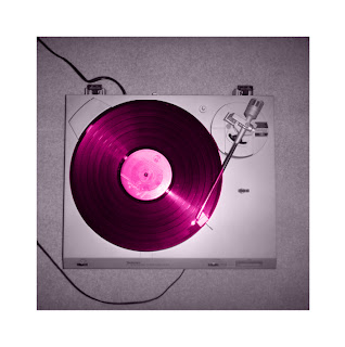
 Also, within final cut, we used the colour corrector to change the end of our video to black and white and to change the colour of the vinyl and guitar to the pinky/purple colour that was running through our brand image. It was very easy to use this tool, all I did was look in the Browser, clicked on colour corrector and dragged it onto the part of the footage that I wanted to change. I then rendered it by pressing 'cmd and R' on the iMac we were using. Once this had rendered, I double clicked on the footage and opened the colour tool. Here, we moved the tool around and the colour ball until we got the correct colour, we could tell we had the right colour as I was watching the Viewer window where I could see the colour changing. Once we had the correct colour, we clicked apply and then rendered the footage again. This made sure that our changed had been made and from this, we changed some of the footage to black and white and some to pinky/purple.
 As we continued with our music video and ancillary tasks, we used a mixture of video cameras and still cameras to collect our footage and images for our ancillary's.

We took this image with a still camera, they are very good quality and were very easy to use. This image is the back panel image for our CD but we opened it in PhotoShop and decided to crop it and change the colour to black and white. This worked very well as the image fitted very well with the rest of our panels and music video which was important as it all had to link together.

For our ancillary's, PhotoShop and InDesign were the media techniques we need the most. We got a lot of influence from many other indie bands that appealed to our target audience. For example, this is one of Bod Dylan's album cover.
 We liked this album cover a lot as it is very much our brand image of smoking, drugs, having fun and not having a care in the world. The black images also stand out against the white background and this is a very successful marketing technique as it grabs the audiences eye as they wonder what is going on in the pictures which make them pick up the album. This is what we were hoping our album cover would do and that it would link to the rest of our project. I feel it did this very well.
  This is our front cover for our album. We took all these images with a stills camera and once we had uploaded them onto iMac, we opened them in PhotoShop and started to edit them. All the images were cropped using the tool on the left hand side of the screen and we often had to zoom in to make sure we didn't crop too much off one side than the other. Also, to have our whole project linked, we decide to colour correct the image and make them pinky/purple. This was very easy to do as we just made them black and white and added a tint of colour until we got the colour we wanted. The only problem we found with colour correcting these images was that, we couldn't get them all the came colour and often had to go back and forth from the earlier images to make sure they matched. We changed the colour of all our panels and magazine adverts to appeal to our target audience and make our project recognisable as a brand.
 The background of our front cover, we were going to make it white to start with when we planned it but we though that the images will stand out more and it will look more linked in with our music video if the background is black and that is part of our colour image.
As I have used InDesign before, I find it very easy to use and it is a very good software to use to produce albums and magazine adverts. Within InDesign, we placed all the images we needed for our front cover and sized them down while making sure they fitted into the squares, as some of them were at awkward angles, we zoomed close in on the images and cropped them on angles and rotated them around to fit in. This didn't take long as the colour correction had already taken place and we just had to place the images in.

On InDesign, to get the same colour throughout our products. I used the Colour Picker to find the correct colour and then clicked 'Add RGB Swatch' which meant that the colour was accessible when ever I opened InDesign to edit the images for our CD album and posters.

On the right hand side was the swatches where I placed the many different shades of pink that I found the right one. This also meant that I could experiment with the colours until the house style matched with the rest of the products.

 When we created our CD panels, we had to change the layout to a compact disc to make the images fit and be as much like a real album as they could be. With our magazine adverts, once we had colour corrected them in PhotoShop, we made the landscape advert black and white with just the writing in pink and black to stand out against the background. We used landscape and keep the colours very simple as this would attract the audience and also follows our brand image of experimenting and being different. The magazine adverts didn't take long to produce as we did most of the work in PhotoShop when we blurred the top corners to give the effect of drugs onto the advert. This shows a clear link to our brand image and our audience would automatically recognise the advert with our music video and album. The second magazine advert is more traditional with it being portrait. However, we have pushed the normal conventions with the colour change and the image that is central on it.
 To be able to fit this image into the framing for this magazine advert, we had to crop some of her arm off on PhotoShop but I don't think this really effects the result of this advert. The colour correction of changing it from black and white to pinky/purple worked very well as it clearly shows the brand image colour all the way through our products. Also, once we had changed the colour, we noticed that the writing stood out a bit too much and we wanted it to blend in with the image but also grab the readers attention. I think we managed this successfully as we made the writing blend into the top and the background. It makes it look like the writing is on the top which is what we were going for. When we asked our audience what they thought about our ancillary's, many came back with how much they liked the front cover and this magazine advert as they think they showed the brand image off nicely without pushing it too far. They also stated that they would notice our adverts and album and look at it as the images are interesting and it is different to any albums and advert they have seen lately.
Also, we were told many times how watchable our video is over and over again. This showed us how successful our brand image was and the cinematography, editing, mise en scene and colour have been in this part of the project.
Within the evaluation, not many media techniques have been used apart from blogger, Microsoft word, google, youtube, prezi, powerpoint, final cut and slideshare. I used all of these again as they are very reliable and were the media techniques I needed to complete the evaluation.
As part of our evaluation, we had to answer one of the questions using Prezi. This was knew to me as I have never used this media technique before.


Also, with our evaluation, we used final cut again. We used this to edit our directors commentary about our music video and ancillary tasks. When we were editing the commentary, we found it easier than before as we already know how to use the tools in final cut from our music video. This was useful as it meant we could do this quickly. As part of our directors commentary, we imported a video from youtube into final cut. To do this, we found a converter website for youtube videos to MP4's. Then we copied the UCL and waited for the video to be converted. Once this had worked, we placed the video into the brower of final cut and dragged it onto the time line. We decided to do this as it was a video that shows where our ideas came from for our video and brand image.
As this question had to be a blog post. I typed the answers onto Microsoft Word first. I did this to ensure that I didn't lose any of my answers if I had just typed it straight onto blogger as it is known for sometimes being unreliable. This has happened to me a couple of times and this is know why I type everything up onto Word first and then copy and paste the images and writing over.
Overall, throughout the project I felt that it was successful and I made the products I desired to do. The music video took the longest to create as there was a lot of editing to do and a lot of footage to collect but I felt that we did this to the best of our ability. Using Final Cut, Photoshop and InDesign throughout the project was easy to do. I felt that the CD Album and magazine adverts were very successful to continuing our brand image and kept the style of our band throughout which would appeal to our audiences and this was successful. We knew this had worked from the audience feedback we collected as many of our fellow media students commented on how the brand image was visible all the way through and that our music video appealed to them greatly as they would multi-watch the video. In keeping with the time management and the deadlines. I feel that we pushed the deadlines a little as there was a rush at the end of the project to make sure everything was done on time. However, I don't think this effected our project at all as every product was created to the best of our abilities and we worked well together as a group. When the footage was being collected, this time management was successful as we had all the footage in time to edited successfully. To conclude, I think our products are very successful to the showing of our brand image throughout and it appealed to the correct audience which is what we were aiming for.
By Romany