Sunday 12 December 2010

Progress - Week 4

This week in class and out of class, we have been working on our music video and our ancillary tasks. For our music video, we uploaded the track we are using and made sure the beats matched the video and our video matched the fast paced sound of the track. We found this easy to do and easy to make it match. The only problem we had was finding enough footage for the beginning of our video. This was only a problem as getting our characters being able to film was hard as one of them has a full time job but we have overcome this. This weekend, Friday 10th Dec - Sunday 12th Dec, we filmed the middle and end of our video which is the night out and the morning after.
We had a bit of trouble with the snow at the beginning of the week and the back end of last week as it was difficult to film.


This week, we have also started out ancillary tasks. So far we have planned and designed our magazine advertisements and the 4 panels for our CD. We created our first magazine advertisement and used an image that links directly to our brand image. This was very important for us as getting our brand image across and the link between our video, magazine advertisements and CD is important for our target audience.
We took this image in the studio on black paper in order for the white to stand out against the black and attract the readers eye. Once we decided to use this image, we opened photoshop, sharpened the edges and made the back of the image blurry. We decided to use this effect to show the effect of taking drugs. In order to use this as our magazine advertisement, we broke a rule as we made it landscape. We did this to appeal to our target audience and secondary target audience as it stands out against other magazine advertisements. Once we finished editing it in photoshop, we open Indesign and put the text on top. For the text, we have simply used the name of the song and band and the website of the band. We used bright pink and black for this to stand out and grab the readers attention as they are flicking through the magazine. This also creates hype as audiences talk about the logo and this creates word of mouth about the song and artist. 


At the end of the week, we decided to take some pictures for our CD. To do this, we used a cigarette and found somewhere with signs that said 'no smoking'. This fits our brand image well as it is rebelling against the rules which is a connotation of the rock and roll genre. We decided to use these pictures for the back panel of our CD. At first, we were going to use a simple image like our magazine advertisement but instead we picked an image that shows how the Arctic Monkeys have inspired our brand image a great deal. 


This was the image we have decided to use for our CD, the back panel. We choose this image as it shows our brand image off very well and fits it completely. On photoshop, we cropped this image to make it square and made it black and white. This works well on the back of our CD as we have used colour for the names of the track and the bands name, this makes the CD stand out against other CD's and the font stands our against the dark background. 


By Romany 

Planning - CD back panel

For the back of our CD, we have decided to use an image of someone standing there smoking. We have decided to do this as it fits our brand image very well and would appeal to our target audience. We took many images with the still camera and had a choice of which one to use. 


We were going to use this image for a CD panel or the other magazine advertisement but we decided to not use it. We were going to crop it so the cigarette was only on show and enhance the smoke on photoshop. 
We decided not to use this as even though it gets our brand image across, to appeal to our audiences, we need more on the image than just a cigarette.
This close up of the fingers and the cigarette was a possibility for us to use as either the magazine advertisement or our CD panel. This shows the connotations of our brand image and would appeal directly to our target audience. For this image, we wanted to focus on the cigarette and the signs in the background to show that our target audience rebel against rules and this is a connotation of the rock and roll sub-genre. 
If we were to use this image, we have decided to make this image black and white and make the tip of the cigarette orange.
This image clearly shows our brand image across to our audience. The signs also shows the connotations of our brand image and target audience as teenagers are known to be rebellious and the rock and roll genre puts this connotation across of sex, drugs, rock and roll and rebelling against the rules. 
We really like this image and are seriously considering using it as our back panel for our CD.


By Romany

Planning - How we made the drugs

To put our brand image across, for the magazine advertisements and our CD panels, we have focused on our brand image of sex, drugs and rock and roll to appeal to the rock and roll sub-genre. For this, we used salt instead of drugs to make sure we get our brand image across. Also, this meets the requirement of our risk assessment form and the law. 


This was the start of putting together the image we are using for one of our magazine advertisements. We are using a card and two packets of salt to make the 'line'. 


 This was the next stage of making the 'line'. We were using a card and separated the salt to make sure we only had a think line of it.  
 This was the next stage that took the longest. It involved our whole group taking a turn in using the card and crushing the salt to make it look thinner. 
The last part of making our 'line' out of salt was rolling the money up which would be used to sniff it up. We only rolled the note up to get the effect and make our brand image more advertising to audiences of this sub-genre. 


By Romany

Friday 10 December 2010

Planning - Logo for magazines


This is the logo that we are using for our magazine advertisments. We have decided to use black and bright pink as our house style colours as they stand our against the background of the images. This logo will also be well known as audiences will remember the colours and the font, this is what we are hoping to achieve with this magazine campaign. The logo is also very eye catching to audiences as it attracts the eye.

By Romany

Thursday 9 December 2010

Research - Advertising posters

When advertising any new artist, album, single or tour. A lot of thought goes into how the posters should be created and whether there should be an image or just text to appeal to the different target audiences. The cinematography, lighting, editing and mise en scene also has to be thought of as they have to make sure their brand image is put across though the posters, not just their music and albums.


This is a magazine advertisement advertising The Rolling Stones concert that is coming up. The white text stands out against the black background and this grabs the audiences attention as it stands out in the magazine. 
The main image is very eye catching, you are immediately drawn to the facial expression which makes the audience want to know what the advertisement is about. 
The text also stands out, they have used multiple types of text to appeal to their target audience and their secondary audiences. They have used the house style of the main text, The Rolling Stones, this makes this advertisement recognisable by the audiences as they are familiar with the font and can tell its The Rolling Stones without the bands name.
This advertisement is also a tour advertisement and it is showing the dates of the tour. The dark colours and lighting behind the main image shows the type of songs that Kasabian are known for. The one main image appeals to the target audience and grabs the audiences eye.


Oasis have been very important and influential when we have been researching and planning our music video, CD album and magazine advertisements. The mise en scene of this poster is very 'oasis' and fits the connotations of the genre very well. The black background makes the images of the band stand out and appeal to the audience. The text and font of the band name is well known and remembered by their target audience and their secondary audience. 


By Romany

Wednesday 8 December 2010

Images for our magazine advertisements

For one of our magazine advertisements,  we decided to use an image instead of using our characters on the magazine. We decided to do this to get across our brand image to our audience so the album will appeal to them. We took many pictures with the still camera until we found the right one. We changed some of them in photoshop to see how they worked on a landscape page.


 These are some of the images we picked as we liked them the best. We choose this image as we like the angle, high angle and medium shot. Also, the lighting is sharp but only focus on one part, the line which we weren't really looking to do but we think it works. The props of salt and the card works really well in this image as it shows our brand image really well and appeals to our audiences.
 We like this image as it, again, shows our brand image. The flash that comes off the still camera reflects off the card which doesn't work and ruins this image. The use of the salt, card and £20 note clearly shows our brand image and would work really well as the main image on the magazine.


We like this image as the close up on the props works really well with our brand image and the black background makes the colours of white and pink stand out to catch the audiences eye. This image was tested on photoshop but we felt it didn't work with the look we were going for with our magazine and it didn't leave enough room for our title and the other text that we are putting on our magazine.
 This was the image we choose. We choose this one as we like how the lighting jumps off the salt and the money. Also, we like how the camera has focused on the front of the image and the back of it is blurry. We were going for this effect so we are glad it has worked. Once we decided to use this image, we opened it in photoshop and make it landscape, this is going to be the way our magazine advertisement will be presented. Once in photoshop, we cropped it from the sides a little bit and made the back of the image blurrier than the front of the image. This gives it a very eye catching effect and appeal's to our audience. As this image is black and white, we have added colour through our text which is going to be bright pink. We have used this as it catches the audiences eye and works very well with our brand image.

By Romany


music cover idea

Front of music cover

This is the template that we will be using for the front cover of our music album. I have created this template and will be adding appropriate photos to the polaroids after. I downloaded the Polaroid film image from google and cut/rotated the images to fit to the 'compact disk' layout. I then filed in the spaces between each roll of film on photoshop with bright pink which is the colour we will be using for our consistent house colour. Once the template is complete, we will be adding images to each of the boxes, some of fallon and some of Tom. To highlight our brand image we will be incorperating things such as drugs and cigarettes to maintain the 'rock and roll' image.
We got the idea for our music cover from this photo colleage of Bob Dylan. We liked the way in which the picture is set out, almost as polariods merged together. This image gives off the conoatatoions of 'rock and roll' which our brand image is that we want to achieve. We particularrly like the bottom left photo of Bob Dylan smoking and think it works very well. This photo looks very simple to create but at the same time very effective and would work well for one of our ancilary tasks (music cover).

Back of music cover
This is the image that we are thinking of using for the back cover of our music cd. We have took this image and are going to change the colour in it and add text to help enchance our brand image and create a 'gritty, realistic' photo, . This is a very simple picture but we feel it gets accross our brand image to our target audience. It shows someone smoking a cigarette which helps to show the 'rock and roll' image as he is stood next to a 'no smoking sign' this gives off conoations off rebelious, another feature of our brand image.


 For the back of our music cover, we have took inspiration from this Arctic Monkeys cover. This is a very iconic photo and we feel it works very well. It is very simple and easy to do but at the same time, it looks very effective. It highlights the brand image very easily and gives off the conoations of 'rock and roll' by the fact that a cigarette has been incorperated into the photo. We also like the black and white effect as it gives off a grity/realistic view on the picture. We will be using ideas from this and adding our own to give it our own stance on the brand image.


Inside Pannels


This is the image we got inspiration for, for one of our inside pannels.  It is an album cover from one of the Rolling Stones albums. We feel this image would look really good for one of our inside pannel as our track 'Bad Candy' is about taking cocaine in toilets on nights out. We want to re-create this image of a run-down toilet that looks very working class and dirty. After we have took an appropriate image, we will colour grade the picture to make it looks more old and enchance its 'gritty' look. We might use photoshop to write on the back wall to look like it has been spray painted on of the name of our track/band like 'the rolling stones' is on this image as we feel it looks striking and rebelious. We will change the colour of the text to match our consistant house style font and colour that is shown in all of our practical work.


By Emma


Tuesday 7 December 2010

research for anciliary- fonts

I have researched into different possible fonts that we could use for the consistant house style for our anciliary tasks. When thinking about fonts, I have analysed bands that have a similar brand image to our own and looked at the types of fonts they have used. The font we choose has to highlight our brand image and give off conotations of scruffy, realisim, rock and roll and bold. Below our the fonts of some well-known bands that share the same brand image as ours:

This is the font for the band The Libertines, who our a band very similar to ours. I particularrly like this font as i think it captures their brand image very well. The letters are very bold and stand out to the audience almost like a stamp. They are clear and easy to read, no fancy lettering which is included in their brand image. I really like the way in which the font is set out, it is jaged up and down, like a news paper cutting. It gives off the connoations of messy and a 'rock and roll image' The colours used are to a minimum and are red,black and white which are definarley colours associated with the indie/rock and  roll genre.


This is the font for the band Kasabian, who also are in the British indie/rock and roll genre. I really like this font as it is very plain put at the same time effective. It is quite bold writting which gives off the conotations of their brand image (rock and roll). It shows that they want to make a statement and aren't afraid to. I also like the style of this font as it clear to read and is quite spread out which dominates quite alot of their album cover. The colour of this font is plain which helps capture peoples eye and highlights the realism of the band. The band have used capitals for their logo which helps them to stand out which is part of their brand image, similar to ours. It helps the font to be very 'in your face' which is part of what the music is.


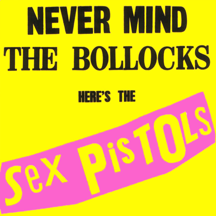
This logo is for a band called Sex Pistols who share some of our brand image components in their image. This font works very well for their brand image, i really like how each letter is a different size or boldness and think it works really well. It gives off cononations of scruffy, mixed up and rock and roll which are included in our brand image. The different letters really help the font to stand out and give personality to it. The words are quite spread out which makes it eye catching and gives off a rebelious image of the band. The letters are quite big which means that the band are egar to stand out from the rest, which is definatley what the sex pistols are about. The colours used are usually block colours and the background is always a different colour, this really helps the letters to jump out of the background which helps you to notice them, something we are egar to do for our own brand image.


This font is for a rock and roll band called The Ramones who share very much of our brand image. This font i think works very well but very easily. The lettering is very bold and thick, gives off the 'rock and roll' connotions of trying to stand out from the rest of the bands. The letters are very close together and uniformed, almost as in a type of cult which is what the music is about. The lettering is always black which gives off a rough, straight to the point image of the band, almost like the music.


These are just some of the fonts we like from bands with similar brand images and music to our track 'Bad Candy'. We have took lots of inspiration and ideas from different fonts and looked at their size, colouring, letter space and boldness. We used various font wesbites such as dafont.com to research and try different fonts to find our consitant housestyle font that we will use for our ancilliary tasks. Below our some of the examples of fonts we have tried out online to see if they work and highlight the brand image that we want to protray:


By Emma


Progress - Week Three

This week when we were editing our music video, we completed the first part of the video with the fottage we had which was our characters getting ready for the night out. We had to delete and cut down lots of fottage in order for it to meet the fast pace of the track we are using as it has to be fast paced editing.

Last week, we also started our research into our ancillary tasks of a CD and magazine advertisments. These have been interesting to look at and research as it gives us many different ideas about our ancillary tasks.


We also used the green screen again last week to re-shoot the fottage of the record player and of Tom running on the green screen. The best thing to do was re-shoot as we got better fottage as the lighting was correct and the green screen didn't shuffle up when Tom was running.

By Romany

Ancillary Tasks: Bands advertised in magazines

When any band or artist are advertised in magazines, it is either to promote their new single, album or tour and somethings it is celebrating the band coming back together, for example, The Beatles and Take That.

Magazines such as NME, Kerrang! and Q all interview and advertise bands that fit with the genre of the magazine and there audiences.

This is from a magazine that were advertising Bon Jovi when they were at the height of their fame. They are advertising a documentry on TV about the band, this is very effective as it appeals to the mass audience. The magazine is also showing that Bon Jovi have endorsed a product, Amps! This is also effective as it gets the sales up of amps espicially as the audiences look up to Bon Jovi and will by what is celebrity endorsed. This still happens today! The use of bold colours and images appeals to the audience's eye as they grab the audiences attention. Even though there has been use of text, it is so small and it is only a small paragraph that the magazine have used big images to sell the band and the endorsed product.


This is a very recent magazine cover from Rolling Stone magazine. They are advertising The Beatles have recently put all there music and albums on iTunes for their fans to download. This album cover is very simple and plain but it appeals to the mass audience. The simple bold colours, red and black stand out against the plain white background. The central image is a very well known image of The Beatles since it was announced that all there music will be on iTunes as it is everywhere on billboards. This shows that one simple image and media hype can appeal to audiences and click in their mind what is going to be in the magazine. Also, the use of hardly any text is effective as it makes audiences open up the magazine and find out the story and what else is in the magazine. This is a very effective selling technique.

Each month or week when a magazine is released, it has a main image and cover story. This Q Magazines main story and image is the sex pistols. They were a very contraversial band at the time they were around as they encouraged teenagers to stay out later and have fun which was not heard of in the time they were about but they are well known and still looked up to today. The main image of John Lydon is central, it is a high angled shot which ironically makes him look big and powerful. The advertisments around the main image that are also featured in the magazine are all connected to the genre of the magazine and the style of it that month.


By Romany

Monday 6 December 2010

Feedback 6/12/10

Good progress group!

- Make sure you ALL have done some research and planning for the ancillary tasks

- Keep blogging your weekly progress too - with pictures if possible!

- The deadline for all practical work is Friday 17th December at 4pm.

Magazine Advert Planning

For our magazine advert, we will be using an image of our actor and actress from the music video. We will also be incorporating the album cover that we have designed so that the public who will see the advert know what the cover looks like. This does generally follow the key conventions of a typical indie music video, however we will include our own original ideas.

The theme of the image will follow the idea of youth and rebellion displayed in the music video we created. The advert will include cigarettes and alcohol and will work well in terms of continuity.

In order to gain public attention we are going to include, at the bottom of the page, tour information and a website link in order for people to get more information or just to look more like the band.

In terms of font, we will be using a consistent house style which will also appear on the album cover. This is good because the consistency means the font is more recognizable for the public. It also helps create a brand image of the band.

Our ideas have been inspired by various artists we have found having carried out research in indie magazines such as Q and NME. We feel that affective adverts come from bands such as Oasis and the Arctic Monkeys as they capture the concept or rawness and rebellion.

By Richard

Thursday 2 December 2010

Ancillary Task

The second ancillary task we will be covering is the music magazine advertisement of our artists. Different magazines cover different genres. For example NME covers indie / rock, kerrang covers just rock, smash hits covers pop and classic rock covers traditional rock music. Here are some examples of covers from various magazines.

The is classic rock magazine. The cover shows the lead singer from rock legends Metallica. This is advertised well because the band are in the right genre of magazine. For advertisemnt to be effective, the product has to be seen by the right audience. The colours are dark. Almost what can be expected from a typical rock magazine. Also, the use of props is good because the guitar can be used in order to draw attention.


This is a cover of the NME magazine which generally cover indie / rock music. The killers are a very mainstream band and almost anyone will have heard their music at some point. This cover works very well because it appeals to the exact audience that would normally read NME. This cover would not work if the band weren't famous, people wouldn't care. The fact that the killers are so popular means people will want to read about them. The three images draw attention and the use of colour in the heading also make the magazine stand out. The fact that the Reading and Leeds festival signs are on the front works well because clearly this magazine applies to anyone going to either festival.


Finally, this is the kerrang cover. Immediately the cover draws attention because of the image. Also, it is obvious which band the cover must be about because slipknot are the only mainstream rock band to continually wear masks during their performances. Advertising works well when a unique selling point about the product is exploited and emphasized, for example slipknot with their masks. The colors again are dark with lots of black and grey, which is typical of rock or heavy metal magazines.

By richard

Ancillary Tasks: Magazine Research

For our second part of our ancillary task, we are producing magazine advertisements for our band and the single or album. Music magazines such as NME, Q, Kerrang! and Rolling Stones magazine. All these magazines have the typical conventions of rock and roll. 


Q Magazine - Lady Gaga


Q Magazine features all the latest bands and artist with a specific genre. It features many rock and roll artists and pop artists. Lady Gaga is the hottest artist around at the moment and by being on the front of this magazine, it sold out in minutes. This cover was very controversial  when it was released but it grabbed the audiences attention through the lack of clothes. The simple use of clothes, black and white also stand out against the grey background. Lady Gaga is promoting her new album and also setting the record straight about the rumours that were around at the time. Whats different about this magazine cover is, Q Magazine is normally a rock and roll magazine but it has a pop artist on its front cover! This makes the magazines more appealing to audiences. I choose this magazine cover as it gives me many ideas for our magazine advertisements! 


Kerrang! Magazine - Guns N' Roses


Kerrang! is one of the most popular rock and roll magazines. This magazine cover shows how popular it is with the most famous rock and roll bands, it features, Bon Jovi, Guns N' Roses! and Metallica. The bright colours of yellow, green and blue stand out against other magazines and grabs the audiences eyes automatically. The most eye catching part of this cover is the main image of Duff McKagan from Guns N' Roses, the close up on his face makes him stand out against the other images and even the title. This is very effective as it gets the attention of the primary audience and the secondary audience as they wonder why the main image is so in your face! 


NME Magazine - Paramore 


NME is notably, the most popular music magazine around today and the most popular rock and roll magazine. This magazine cover is very effective as it has used simple and bold colours and simple mise en scene of the band, Paramore! The simple use of colours such as, Red, Pink, Orange and Black makes the name of the band and magazine stand out and appeal to the audience. Also, the use of colour on the hair and lips of the lead singer of Paramore against the black clothes of her and the rest of the band makes the band stand out and appeal to audiences as Paramore are best known for their lead singer and songs. The text on the front cover also appeals to audiences as it shows how popular they are with having sold 4 million albums. This not only appeals to the primary audience but to their secondary audience as people want to read about how they sold so many albums. This magazine cover really stood out to me as I really like the simple use of colours with the bold fonts, this has given me ideas for our magazine advertisement. 


By Romany

Tuesday 30 November 2010

Ancillary Tasks: Advertisment research

I have analysied some music magazines that feature bands that have a similar brand image to ours, i am going to research into how brands market their new albums/singles in magazines that are seen by their target audience, magazines such as NME, Q and Rolling Stone. In order for artists/bands to sell albums, they need to market and advertise their products so that their target audience is encouraged to purchase them. By featuring in a magazine, typically for the bands genre, this gives them a good chance to sell their products to the right market of people. When a band are advertising their products there are lots of things that they need to think about, such as: Where to advertise, how to advertise, shots, lighting, mise en scene and text included etc.

Arctic Monekys (Album- Favourite worst nightmare)

This picture shows Arctic Monkeys on the front cover of the indie magazine NME, they are advertising their new album 'Favourite Worst Nightmare' hoping that people who like the 'indie' genre will buy it. Arctic Monkeys have been very clever and advertised their album  to come out just before christmas, this is a very good advertising technique as people will buy it as present. It shows the band dressed up as elves which catches your eye at first glance, something that the band want to achieve. The bands name is in big bold letters as peope who buy NME magazine will be very farmiliar with the band, so it will encourage them to read on. I think Arctic Monkeys have been very clever by advertising their new album in this way, it shows the lead singer at the front of the shot because fans will be most farmiliar with him. Even though the band are dressed up, their is still serious exressions on their faces which i think suits their brand image very well. 


This is another feature of the band Arctic Monkeys on their album 'Favourite Worst Nightmare', this is also advertised in the same magazine as before (NME) but inside the band have taken a different approach and done a page spread of the album inside the magazine. This page is an interview with the band discuissing what the album is about which i feel is a great advertisment technique, it will encourage fans to become farmiliar with the album and be attracted to buying it. The page also included quotes from various people who 'big up' the album, which is a good persuasive technique. I think that the layout of the page really suits the brand image of the band, the shot of them is very plan and of a serious manner which is what the bands brand image includes. It shows them in simple, stylish clothes which are also what the band are known for. The lighting of the shot is very affective, the background is plain and the lights are focused on the band which helps to catch your eye at first glance. The colour sceeme of the page, also matches the album that they are advertising which makes the page look neat and catches your eye as it is not overpowering.

By Emma

Ancillary questionnaire results


Once I gathered the results from our questionnaire, I put them in graphs and analysed the results. It is important for us to understand why we have got these results and put them in our brand image and ancillary tasks which will appeal to our audiences and our secondary audiences.

By Romany

Ancillary Tasks: Questionnaire

Before we plan our album, 4 panals and our magazine advertisements, I have put together a questionnaire which we are going to hand out to 10 people in our target audience age range to find out what attracts them to albums and magazines. This is important researsh as it gives us excellent feedback to which we can reply to our projects to make them appropiate to our target audience and our secondary target audience.

To make this questionnaire, I used Miscrosoft word to put the questionnaire together and I then used scridb to change the format of the questionnaire to be able to upload it to blogger.
 

I have created this questionnaire to get as much information as possible from our target audience to understand what is needed from our ancillary tasks to appeal and sell on the market.

By Romany

Monday 29 November 2010

Progress - Week Two of practical

This week, we started to edit our music video and we also did some filming using the green screen with one of our characters, Tom. When we were filming using the video camera, we also took some still pictures using a camera to show what we were doing. This week, we used a video camera, tripod, green screen, the professional lights, iMac computer and final cut express which we are editing our music video on. 


This is the green screen with the back lights focusing on the vinyl which we put in the middle of the green screen to get the best lighting we possible could. We had to put an extention lead on the green screen in order for the vinyl to work but we made sure it wan't in shot. 


This is Richard putting the name of our song on the vinyl, we wanted to test this and see if it would work in black and white. When we edited, we came to the conclusion that it didn't work which means we have to film this bit of the video again. 


This is me recording the vinyl spinning around and trying to get the best shot possible and use the lights effectively. The video was recording a close up on the name of the band on the vinyl.


This is a picture of Richard filming Tom running on the spot on the green screen. We have done this to show our techniques in using the green screen and the lighting. Also, we have filmed this as we are showing our characters running against the power of the vinyl to represent their state of mind as they are on drugs. 


However, once we started to edit the filming we did in the green screen, we noticed that the lighting wasn't correct which brought us to the agreement of filming the scenes again and taking more time lighting the room correctly. 


This is the first part of our editing, we have used colour correction to make our footage black and white and to distort our image a little. 


This is Richard editing some of the filming we did the night before, we are using the guides as well to make sure we used the correct techniques.
This is me editing the colour, I have increased the blackness to make it more distorted and I was checking the guide to make sure that I had used the right techniques.
Here is Emma finishing up the first part of editing the colour of the start of the video, as we had some lines around our image, Emma was changing the numbers to try and refine the lines around the side of the films. 


By Romany


Sunday 28 November 2010

Editing and Filming Schedule

Over the next 4 weeks, we have to finish filming and editing our music video and produce our ancillary tasks which include, digipacks and magazine advertisements. These also include research and planning. 


This week, we are editing our music video in lesson and after college between 4pm and 4:45pm, we are staying behind after college as we need to spend lots of time editing our video to make it applying to our target audience and make it successful to fit into our brand image. On tuesday, we are staying behind at college again from 4pm till 4:45pm to film some more of our music video in the studio where we will be using the green screen and lights again. 


In the next following weeks, we will be editing our music video and our ancillary tasks before our deadline at christmas. 


By Romany, Emma and Richard

Ancillary Task Digi Pack research

Album covers are often defined by the genre of music the album contains. They sometimes can be relevant to the genre or random. The factors that make some album covers different to others are colours, fonts and images. Album covers can be used to draw in public attention however also can create varying ideologies depending on the person looking at it.


This Gnarls Barkley's cover for his debut single called crazy from his first album St. Elsewhere. I like this album cover because of the connotations that it creates. The colours work fantastically well against the white background because of the extreme contrast. This could possibly be used in order to catch peoples eye when sitting on a shelf. I also like the animated image on the front. It looks quirky and different to what would usually be expected from any other hip-hop artists.

Referring to the point I made before, the album cover can be influenced by the genre. This is the cover for Fyfe Dangerfield's album called Fly Yellow Moon.


I particularly like this album cover because of the image. Fyfe Dangerfield is an english indie artist. As can be expected from indie music, the cover is very random with the man dressed in a suit emerging from a field of yellow flowers. However, the colours in the image do relate to the title of the album, 'fly yellow moon'. Although I cannot find any images of it on the internet, having bought this album, I discovered that the yellow flowers theme runs all the way through rest of the casing. The theme also on the disk it self. This gives an idea of recurrence and creates a consistent theme.


This is Iron Maidens cover for their biggest single Number Of The beast. I like this album cover because it continues the typical Iron Maiden theme of animated demonic, scary characters. The colours are naturally dark colours but however seem to stand out on this cover. Iron Maiden have used the characters they use on their album covers as a marketing strategy. Each character has been named and now are sold as memorabilia. Iron Maiden also have used the same font throughout all of their albums. This makes it immediately clear to anyone exactly who the record is by. It is this recurring theme that make Iron Maiden covers so recognisable.

By Richard

Ancillary Tasks: Digipack research

To go along with our music video, we are also producing digipacks and magazine advertisement's to fit with our brand image and target audience. We have researched many album covers and magazines to gather ideas and create our own.


The Rolling Stones - Exile on Main Street.


This is the tenth british album and twelfth american album by The Rolling Stones. This album cover applied to me as it is the brand image of Rolling Stones. The main part that applies to me is the black and white images and the one colour image which is their logo and it very well known around the world, especially from their album - Forty Licks. The images on this album betray the typical connotations of the rock and roll life style of drugs, partying and sex. The images are also a bit distorted which can symbolise the state of minds of the band. This album cover appeals to the rebellious, drug using teenagers who are out to have fun and this is what The Rolling Stones and our brand image is about. This album cover applies to the working class and our brand image and target audience applies to the working class, which is why we are using The Rolling Stones to gather ideas about our own brand image, digipacks and magazine advertisements. The props that are involved in this album cover are very typical of the rock and roll life style which applies to so many teenagers. This type of art work on the album cover is something we are very interesting in doing ourselves and maybe using this type of editing to create the same feel with our album cover that The Rolling Stones created. 


Led Zeppelin


This is a very simple album cover by Led Zeppelin but it is very effective. The random images over the colour represents the different brand image that Led Zeppelin has but they are mostly known for their rock and roll life styles. The simple colours on a white background make this album cover stand out and be recognised, it also fits the target audience of Led Zeppelin. This theme runs throughout the album and applies to the whole target audience. It is also very different to the type of music Led Zeppelin  produce and promote, the art work if very calm compared to the music but it represents the connotations of rock and roll very well as the images are random and they show drugs, sex and rock and roll. 


This is inside of the album and the disc. I like the randomness and the use of bright colours on the CD as it stands out from other rock and roll band and is noticed by their target audience which they have promoted very well too. The way the images are just put together on the CD is very well done and it applies to many audiences and has given me ideas for our album cover. 


To make sure we create the right 4 panels for our ancillary tasks, we are going off templates which professionals use in order to create a CD relevant to their artists.


This is a template of a CD case, these are used in order for the CD to be created properly and to make sure it appeals to the primary and secondary target audience. 


Sex Pistols

When this album by the Sex Pistols was released it was highly influential and controversial as they were a punk british rock band. This is a very well known album cover and has influenced many albums since then. The bright colours of yellow, pink and black all stand out against each other and this is the brand image for the Sex Pistols as these colours run throughout there many albums. I have chosen this album to look at as it is very successful in appealing to its target audience and they know there brand image very well. I really like the logo of the Sex Pistols and how they have used the bright colours effectly. This shows connotations of there genre which is mix matched. The fonts on this album cover continue throughout there other albums as it is their housestyle and it makes the audiences aware of them as they automatically associate this font and housestyle with the Sex Pistols.

By Romany