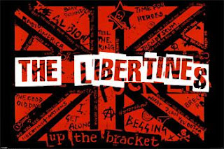
I have researched into different possible fonts that we could use for the consistant house style for our anciliary tasks. When thinking about fonts, I have analysed bands that have a similar brand image to our own and looked at the types of fonts they have used. The font we choose has to highlight our brand image and give off conotations of scruffy, realisim, rock and roll and bold. Below our the fonts of some well-known bands that share the same brand image as ours:
This is the font for the band The Libertines, who our a band very similar to ours. I particularrly like this font as i think it captures their brand image very well. The letters are very bold and stand out to the audience almost like a stamp. They are clear and easy to read, no fancy lettering which is included in their brand image. I really like the way in which the font is set out, it is jaged up and down, like a news paper cutting. It gives off the connoations of messy and a 'rock and roll image' The colours used are to a minimum and are red,black and white which are definarley colours associated with the indie/rock and roll genre.
This is the font for the band Kasabian, who also are in the British indie/rock and roll genre. I really like this font as it is very plain put at the same time effective. It is quite bold writting which gives off the conotations of their brand image (rock and roll). It shows that they want to make a statement and aren't afraid to. I also like the style of this font as it clear to read and is quite spread out which dominates quite alot of their album cover. The colour of this font is plain which helps capture peoples eye and highlights the realism of the band. The band have used capitals for their logo which helps them to stand out which is part of their brand image, similar to ours. It helps the font to be very 'in your face' which is part of what the music is.
This logo is for a band called Sex Pistols who share some of our brand image components in their image. This font works very well for their brand image, i really like how each letter is a different size or boldness and think it works really well. It gives off cononations of scruffy, mixed up and rock and roll which are included in our brand image. The different letters really help the font to stand out and give personality to it. The words are quite spread out which makes it eye catching and gives off a rebelious image of the band. The letters are quite big which means that the band are egar to stand out from the rest, which is definatley what the sex pistols are about. The colours used are usually block colours and the background is always a different colour, this really helps the letters to jump out of the background which helps you to notice them, something we are egar to do for our own brand image.
This font is for a rock and roll band called The Ramones who share very much of our brand image. This font i think works very well but very easily. The lettering is very bold and thick, gives off the 'rock and roll' connotions of trying to stand out from the rest of the bands. The letters are very close together and uniformed, almost as in a type of cult which is what the music is about. The lettering is always black which gives off a rough, straight to the point image of the band, almost like the music.
These are just some of the fonts we like from bands with similar brand images and music to our track 'Bad Candy'. We have took lots of inspiration and ideas from different fonts and looked at their size, colouring, letter space and boldness. We used various font wesbites such as dafont.com to research and try different fonts to find our consitant housestyle font that we will use for our ancilliary tasks. Below our some of the examples of fonts we have tried out online to see if they work and highlight the brand image that we want to protray:
By Emma


No comments:
Post a Comment